Why I use a two-color watercolor mixing chart
and the more traditional watercolor color mixing charts I tried first
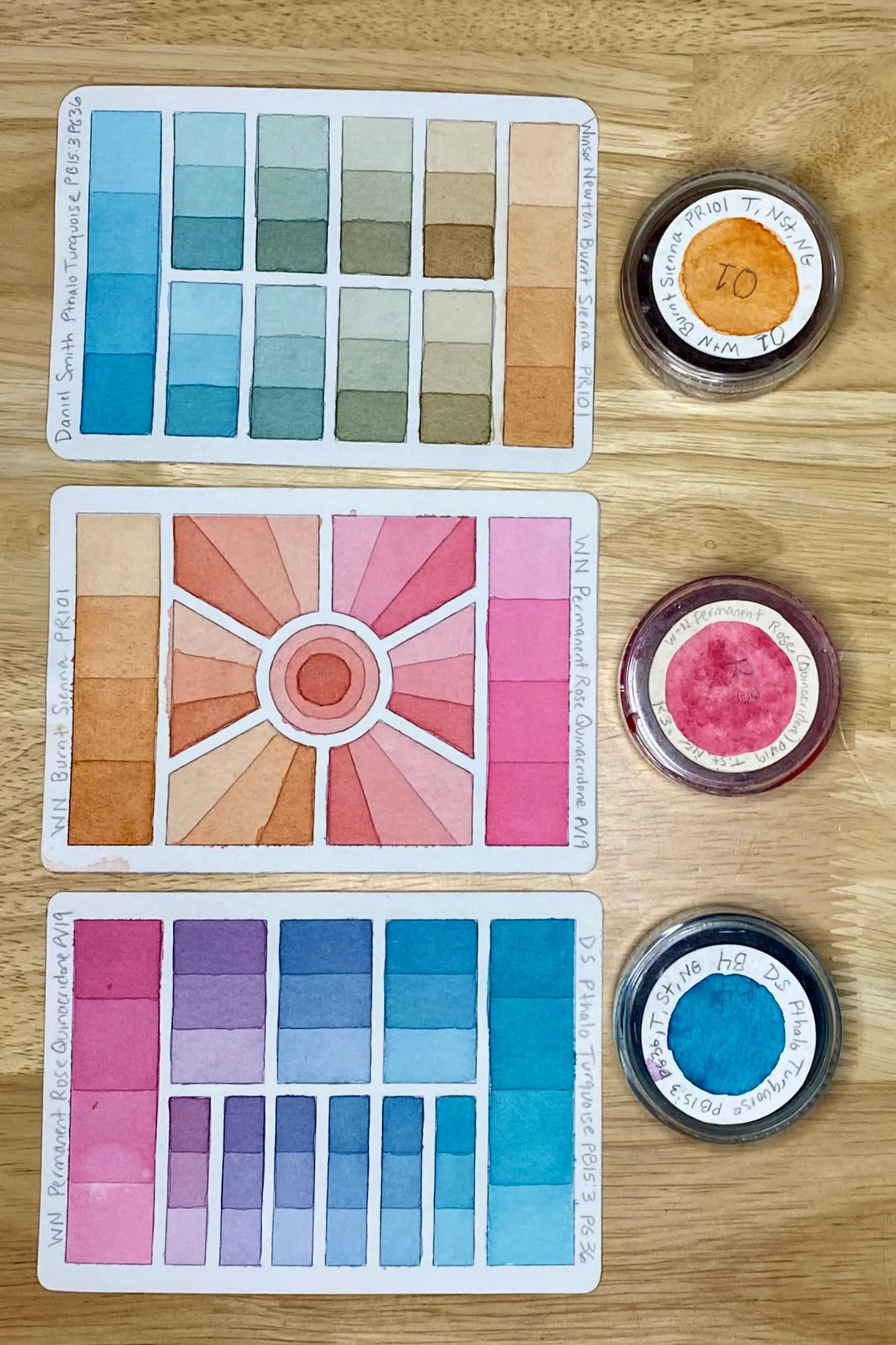
Three examples of two-color watercolor mixing charts, combining Daniel Smith Pthalo Turquoise, Winsor Newton Burnt Sienna, and Winsor Netwon Permanent Rose.
First, what do I mean by a traditional color mixing chart? It’s like a mathematics table — you make a grid with each color on your palette listed across the top, and again down the side. Where the column and the row of each color intersect is where you record the mixture of those colors. This provides two spaces for each mixture.
Example of a traditional full palette color mixing chart that looks like a grid.
Pros of a traditional color mixing chart
It’s perfect to transport if you like to paint plein air (on location) for a quick and easy general reference to what your paints will do when mixed.
It’s good for providing a very quick overview of the mixing possibilities of your favorite paints, perfect for you if you’re absolutely in love with your chosen colors and you don’t deviate from them often, or maybe only seasonally.
It can be made quickly in one day and hung on a wall or in a sketchbook for easy viewing.
Cons of a traditional color mixing chart
As soon as I complete a perfect traditional watercolor color mix chart, I inevitably find a color I want to swap out on my palette. This makes a column and a row wrong. I have cut paper and pasted it over those in the past, but more often, I repaint the entire chart.
The traditional color mixing chart only provides space for two possible mixes for each pair of colors when there are so many more possibilities, especially for two colors that are located far apart from each other on the color wheel, such as complimentary colors. My two-color charts show 7-8 different possible mixtures.
Traditional color mixing charts generally only show one value of a color mixture (or two values apart from each other). For example, it ‘s difficult for me to imagine a dark maroon mixture as a skin tone, but highly diluted, it looks stunningly perfect. (note: If the chart is large enough, I can paint diluted gradients inside the grid.)
The traditional color mixing chart doesn’t include specialty colors, or the ones that I only use for certain subject matters, or color moods or seasons, or the ones I saw on your blog or YouTube Video. So I’d have to paint a new chart.
There isn’t any way to incorporate large wet into wet washes to see how the two paints interact in a traditional watercolor color chart. Some are quite powerful and charge into others, while some stay quite put.
The color mixtures you see are affected by the color mixtures around it on the chart. The perceived hue, saturation, and brightness of a color can change based on colors next to it. I don’t want to deep dive into science, color science is an ocean, so here’s a tiny sip.
Optical color mixing occurs when small dots or strokes of color are placed next to each other (used by the impressionist masters.) Optical color mixing can be used beautifully in artwork, but it may also influence the way you see the colors on your mixing chart, depending on the size of your grid.
Michel Eugene Chevreul's Law of Simultaneous Contrast of Colors states that color is relative to the colors around it. Handprint A color can appear darker when placed next to a lighter one, or brighter next to a complimentary one.
My first attempts at a better color mixing chart system
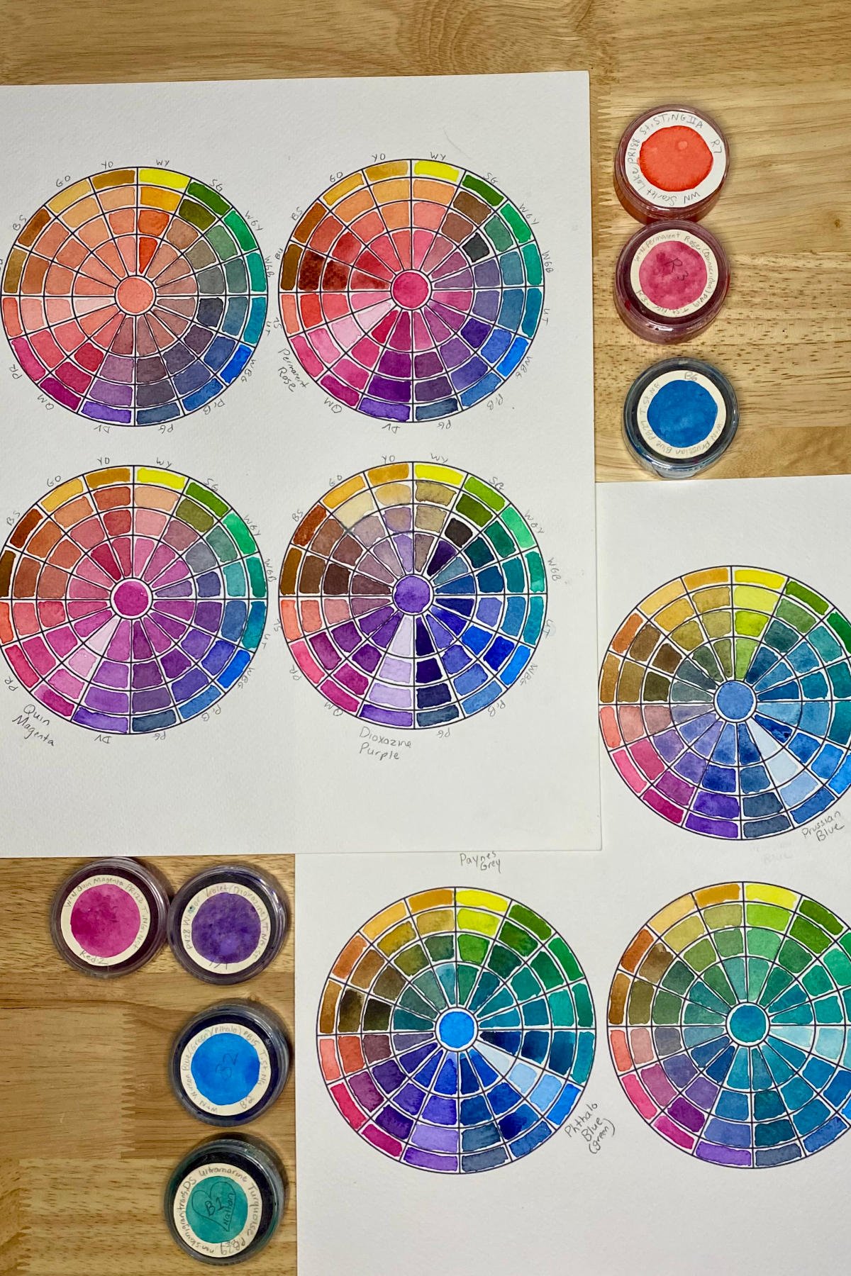
Examples of watercolor mixing charts which circle around one focal color, creating a color story
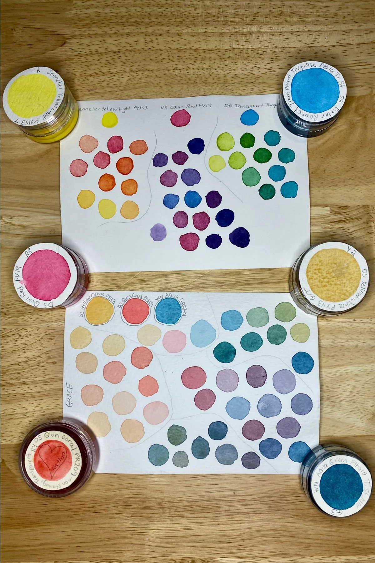
My first venture into a better color mixing chart was creating mini circle charts for each color. I’d put the focal paint in the center of the circle and then make three mixtures with each paint around the circle. This only minimally improved from the traditional chart. I still had the problem of wanting to swap out or add a new paint. I didn’t have a way to see large wet into wet washes with the colors mingling. I did get three mixtures instead of two, including 25/75. 50/50, and 75/25 ratios, and while the colors were still influenced by others nearby, I liked the “color story” of each paint, and the lighthouse effect.
Examples of three-color gradient mixing charts
Next, as I really leaned into limited color palettes, I started painting 5x7 “chart” cards for limited palettes of three paints. I’d create the three possible gradient mixtures on one side, which progressed to adding glazed layers to create more values. On the other side of the card, I set up quadrants, and painted many different mixtures and values of each color combination very organically. I LOVED looking at these when I’d pull them out of the recipe box where I stored them. They made my soul happy, and guided pieces of art. But they started falling short when I wanted to add another color or two, still a very limited palette of 4-5, but exponentially increasing the spaces I’d need.
Examples of three-color watercolor mixing swatches
Those three-color charts still have a place in my color catalogue whenever I fall in love with a limited watercolor palette, and whenI want to make a series of paintings with it. The benefit of the three-color mixing charts are that they show the darkest, most beautiful neutrals. More on that in a future post.
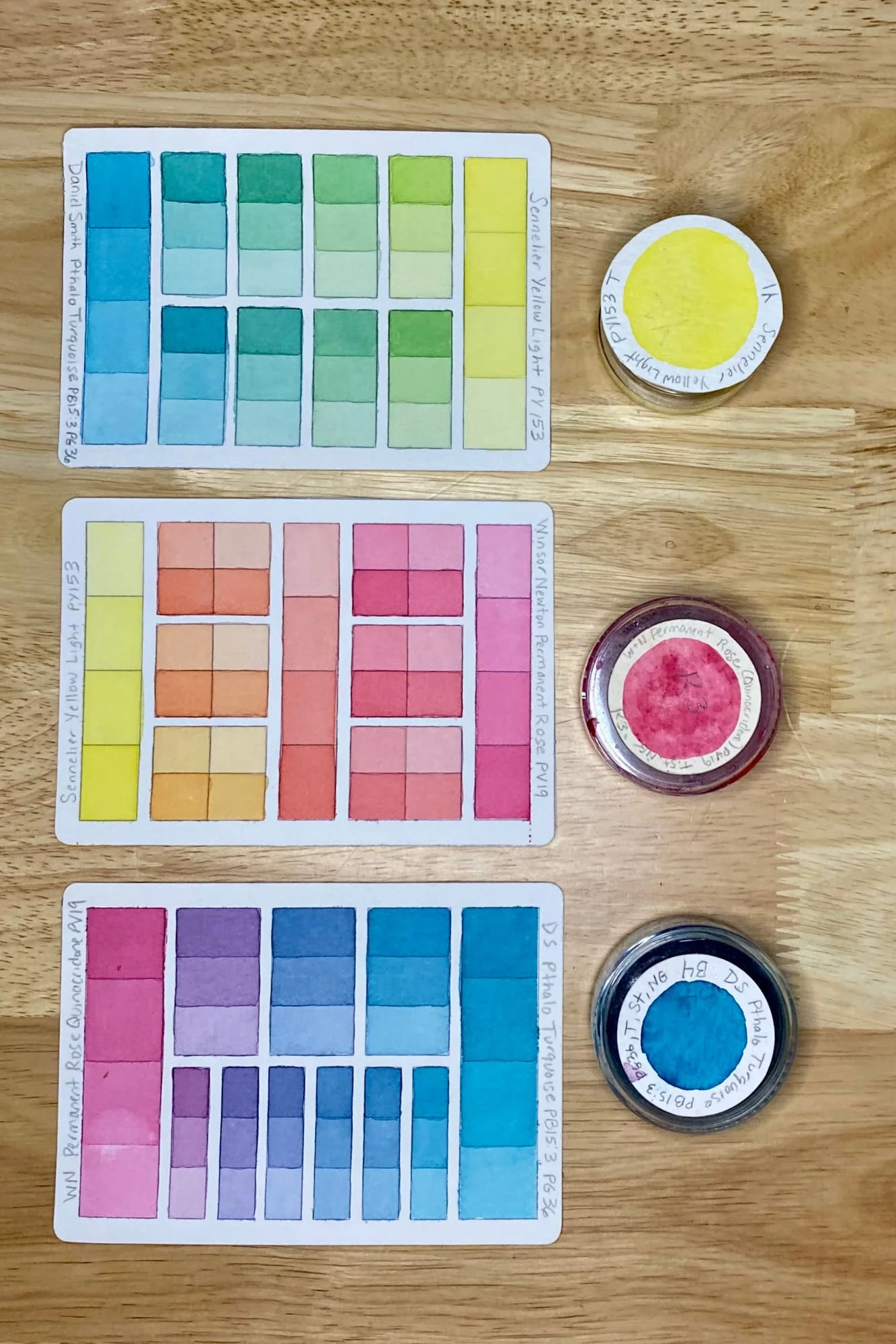
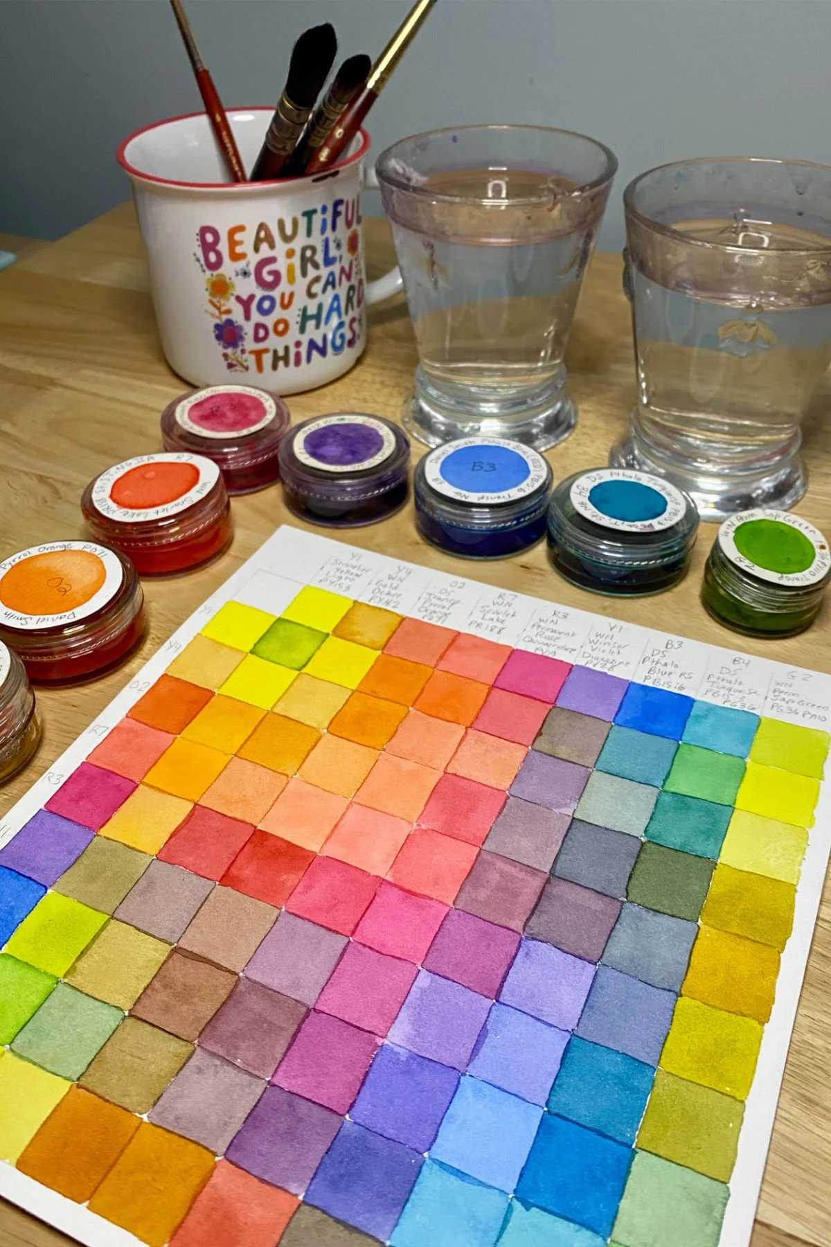
Examples of my two-color watercolor color mixing charts together as a limited watercolor palette
Finally, everything finally felt perfect when I began making two-color watercolor mixing charts. I started with postcard size, but realized my binder was getting thick rather quickly, and it was difficult to visualize a larger 5-color palette on one page because of the size and number of the cards. I finally landed on a trading card size of 2.5 x 3.5 because there are many storage systems designed for trading cards, and many sizes of watercolor paper cut down efficiently into the 2-½ x 3-½ in size, which was big enough to capture all I needed to know.
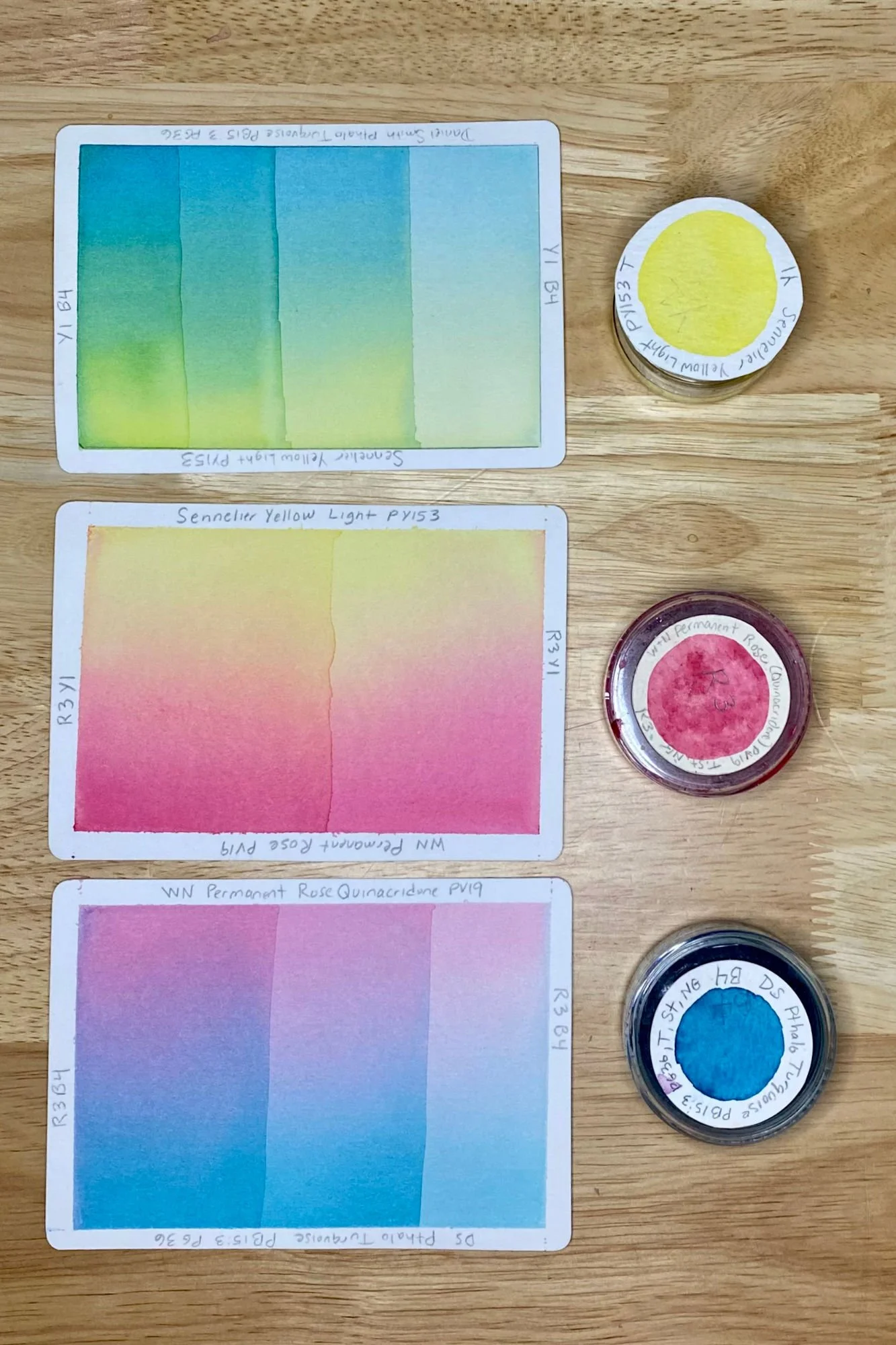
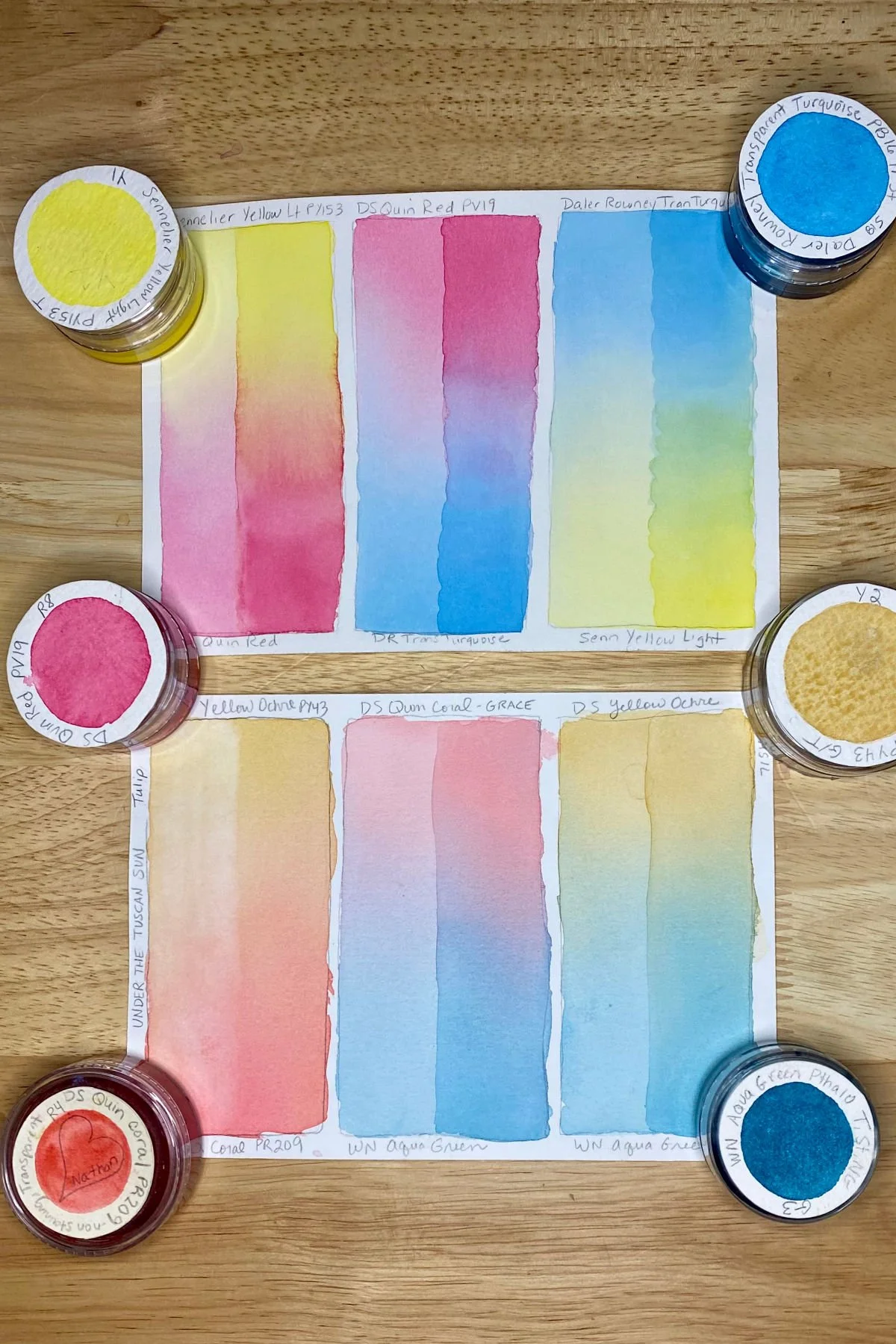
Examples of my two-color watercolor mixing charts as wet-into-wet gradients
The benefits of a two-color watercolor color mixing chart
I can make as few as three but up to eight mixtures for each two-color combination. I make fewer mixtures when mixing two colors that are near each other on the color wheel, such as a primary and its secondary, like blue and green, because there aren’t as many “steps” between them. I make more mixtures when the two colors are far apart or across from each other on the color wheel, such as compliments blue and orange. I’m always amazed at the number of distinct mixtures that result.
I can show 3-4 values of each mixture right next to each other, replicating how glazing works in painting. If I want to start darker and dilute out a gradient, I can visualize that.
The mixtures are only influenced by the other colors I chose. I can look at many different reds mixed with a single blue without any oranges next to it on a traditional chart to dull out the blue and intensify the red.
I used the back of the card to create a wet-to-wet mixture, where I let the colors mingle and interact in water as a gradient. Some colors charge into other colors, and some colors just don’t move. This is invaluable information before painting.
A four-color limited watercolor palette is my sweet spot, and I can fit all the cards into a single trading card binder insert, with room for some three-color charts showing the dark neutrals. I can easily visualize my entire limited color palette in a very portable format without the distraction of colors I’m not using.
AND best of all, I can swap out colors for the exact purpose or painting I want without redoing anything. The two-color charts are evergreen, and great to mix-and-match like a game of dominos or a choose your own adventure game.
In the next few posts, I’ll demonstrate how I make mixtures consistently and easily using a measured glazing technique, and then I’ll explain my indexing organization system- I am a librarian after all.
A short video showing multiple two-color watercolor mixing charts stored in a 3-ring binder.